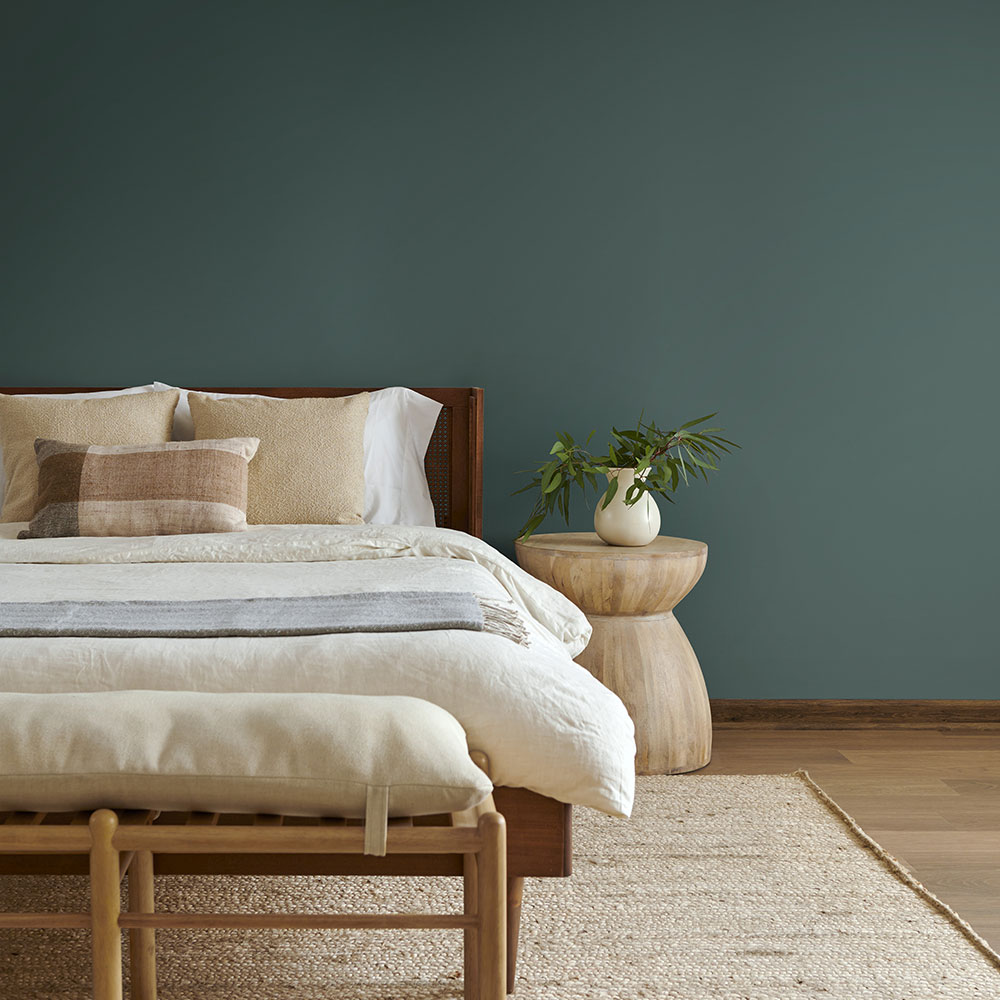
Paint is the cheapest renovation in home decor. One wall, one weekend, one can of paint. And yet it changes everything: the light, the mood, the way the room feels at 7am versus 7pm, the way you feel in it.
The problem is that choosing a color is genuinely hard. Because you’re not just choosing what looks good. You’re choosing how you want to feel in that room, every single day, for the next several years.
So instead of giving you a list of colors that are just pretty, here are 5 that are genuinely mood-lifting, backed by both color psychology and the designers who are currently recommending them for 2026. Each one works on a budget because paint, no matter the brand, is still one of the most affordable changes you can make to your home.
Color 1: Warm Sage Green
If you’ve been scrolling home content for any length of time, you’ve seen green everywhere. And there’s a reason for that: green works. Specifically, the right shade of green, which right now means warm, earthy, slightly muted sage, not the bright emerald or the cold mint.
Warm sage green reads as grounding and restorative. It’s associated with nature, which is why it reduces stress and makes a room feel calming without feeling cold. It works in virtually every room: bedrooms, living rooms, bathrooms, and kitchens alike.
For 2026, designers are particularly recommending:
- Benjamin Moore Creekside Green for a soft, earthy version
- Sherwin-Williams Muddled Basil for something richer and moodier
- Valspar Warm Eucalyptus for a version that’s simultaneously cool and inviting


What it pairs with: warm wood tones, cream and off-white, terracotta accents, natural linen. Essentially, anything that feels organic and warm sits beautifully next to sage.
The budget approach: You don’t need to paint all four walls. In fact, one sage green wall in a bedroom behind the bed is one of the highest-impact, lowest-effort changes you can make. One can of paint, a few hours, and the whole room shifts.
Color 2: Dusty Rose or Warm Pink
Pink has had a complicated relationship with interior design. For a long time it was dismissed as either too feminine or too trendy. But in 2026, warm, muted, dusty rose tones are being used by designers across the spectrum, and for good reason.
Warm pink is psychologically linked to calm and comfort. It’s not stimulating like a bright primary red. Instead, it’s soothing, approachable, and surprisingly versatile. It works in spaces where you want to feel relaxed rather than energized.
IKEA chose Rebel Pink as its 2026 Color of the Year precisely because this version of pink is “full of energy” while still being light enough to function as a near-neutral in many spaces. Dusty rose walls with warm white trim and natural wood furniture feel considered and calm, not childlike.
Where it works best: bedrooms, reading nooks, bathrooms, and any space where softness is the goal.
The budget approach: If you’re not ready to commit to a wall, dusty rose works beautifully as a ceiling color. It’s one of the most underused surfaces in a home, and therefore one of the most surprising and effective places to add color.
Color 3: Deep Teal or Moody Blue-Green
This is the one for people who want to feel something in their room. Not calm, not energized, but enveloped. A deep teal or smoky blue-green creates what designers call a “nest effect”: the room wraps around you.
Behr’s 2026 Color of the Year is Hidden Gem, a smoky jade blue-green that designers are describing as “both dramatic and soothing.” Multiple major paint brands have landed on green for 2026, which means this direction is strong enough to be more than a passing trend.
Deep teal is specifically effective in rooms where you spend time at night: dining rooms, home offices, bedrooms. Because it absorbs light rather than reflecting it, it makes the space feel more intimate as the light dims. In the evening, consequently, a teal room looks completely different from how it looks at noon.
Where it works best: bedrooms, dining rooms, home offices, and alcoves or reading corners where you want to create a sense of separation from the rest of the space.
The budget approach: Deep colors are the best argument for painting just one wall or the inside of a bookcase or alcove. The impact is disproportionate to the amount of paint used, which means you get a high-end look for a fraction of the cost.

Color 4: Rich Terracotta or Warm Red-Brown
Terracotta has been a trend for a few years now, and yet it still isn’t going anywhere. That’s because it’s not really a trend. It’s a color that has been used in homes for centuries, and there’s a reason it keeps coming back.
Warm red-brown tones, from soft terracotta to deeper oxblood and brick, are energizing without being aggressive. They’re the red family toned down to its warmest, most livable version. Designers describe them as creating “drama without overshadowing,” and they pair with almost everything: cream, olive green, warm wood, navy, mustard yellow.
For 2026, designers are noting that saturated reds and warm red-browns specifically satisfy a craving for “mood and emotion” in interiors. After years of grey and beige dominance, people want their homes to feel like something.
Where it works best: living rooms, dining rooms, hallways, and kitchens. Terracotta in a kitchen is particularly good because it’s warm and appetite-stimulating without being as intense as a true red.
The budget approach: Terracotta is one of the most forgiving colors to apply yourself because the warmth of the tone hides minor imperfections in application. It’s therefore a good choice if you’re painting a room for the first time and want a color that’s bold but not technically demanding.
Color 5: Warm Off-White (Not Stark White)
This one might surprise you on a list of mood-lifting colors. But hear this out: most people who think they want white actually want warm off-white, and they only realize the difference when they see stark white under their actual home’s light.
Warm off-whites, creams, and what designers are calling “greige” (a warm grey-beige hybrid) are having a major moment in 2026, but not in a boring way. They’re being used as the backdrop that makes everything else in the room pop. Moreover, warm white walls make natural light feel warmer, make wood tones look richer, and make colorful furniture and accessories look more deliberate.
The mood lift here is more subtle than sage green or teal. But it’s real. A room painted in warm off-white feels cleaner, lighter, and calmer than the same room in stark white or cool grey.
Currently recommended: Sherwin-Williams Alabaster sits between white and off-white with a gentle cream undertone. Farrow and Ball’s All White is cooler but softer than stark white. Benjamin Moore White Dove is consistently one of the most recommended warm whites in interior design.
Where it works best: everywhere, genuinely. But especially in rooms with limited natural light, where a warm white will make the space feel much brighter than a cool white or grey ever would.
The budget approach: Off-white is where you can save on the paint brand without visible sacrifice. Because it’s not a complex or deeply saturated color, the difference between a budget and a premium brand is less noticeable here than with rich colors. Therefore, this is the one place where own-brand paint from a DIY store is a reasonable choice.
Before You Paint: The One Step Everyone Skips
Test the color in your actual room, not on the brand’s website, not in someone else’s photo, not even in the store.
Buy the tester pot. Paint a large rectangle on the wall, at least A3 size. Look at it in the morning light, the afternoon light, and at night with your lamps on. Wait 24 hours. Look again.
Colors shift dramatically depending on the light in a room and the other colors around them. What looks perfect in a bright showroom can, as a result, look completely different in a north-facing bedroom. The tester pot costs 3-5 euros and can save you from a 50-euro mistake.
Paint the wall you’re most nervous about last, not first. Start with an accent wall, live with the color for a few days, and then decide if you want to go further.
Save this and come back to it when you’re standing in the paint aisle feeling overwhelmed. The right color is on this list. And if you’re still unsure, go with the sage. It’s basically never wrong.

Leave a Reply